not more cluttered."
What a user told us. It became the brief.
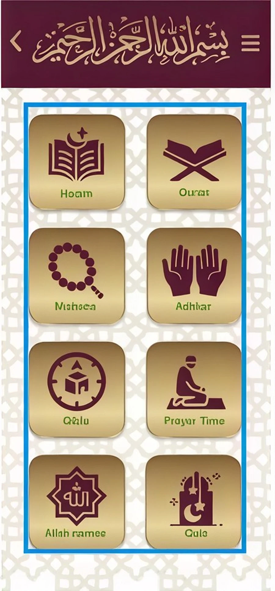
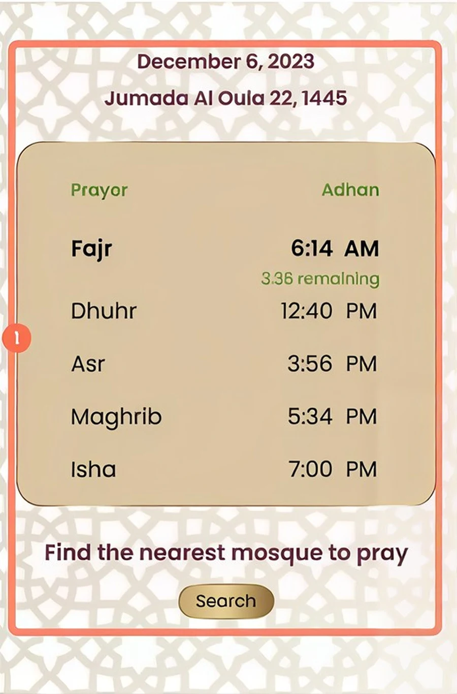
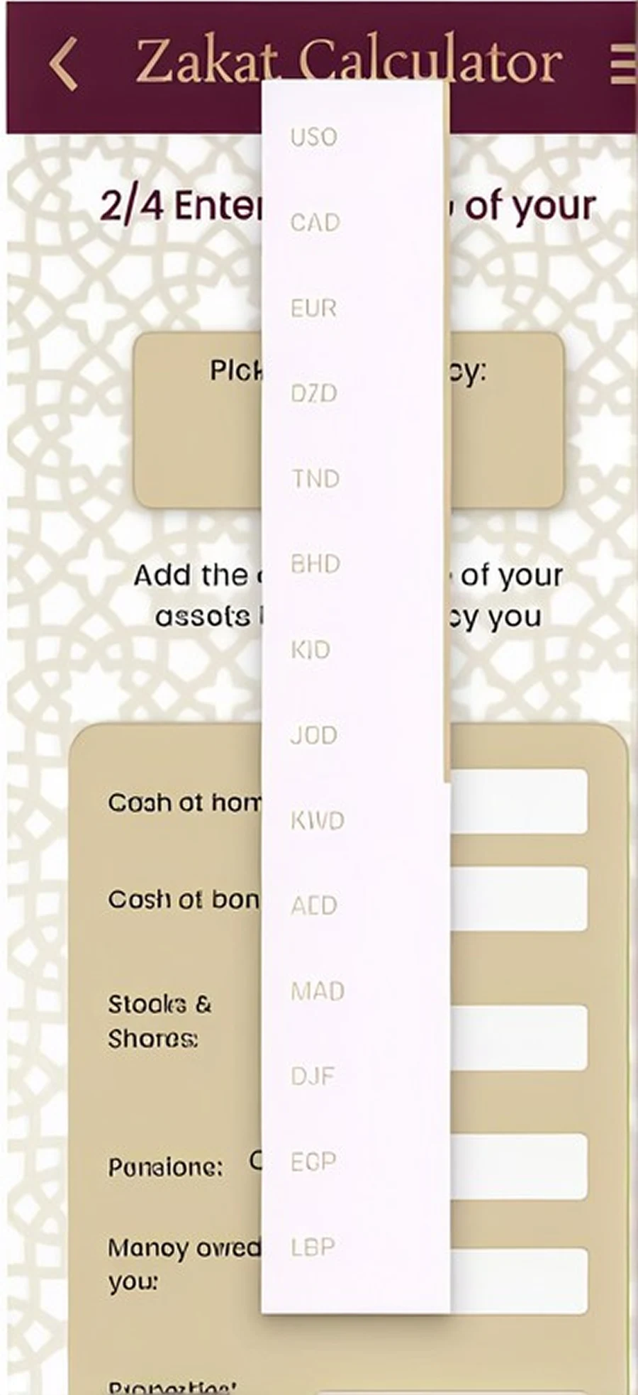
Muslim Guide had the right foundations: prayer times, Qibla, Quran, tafsir, nearby mosques. But it had no clear design strategy, an outdated visual style, and a flow that made simple daily rituals feel like work.
The goal: a simple, clear and modern experience for non-native Arabic speakers, new converts, busy professionals and older users alike.
Useful content. An interface that got in the way.
spotted screen by screen.
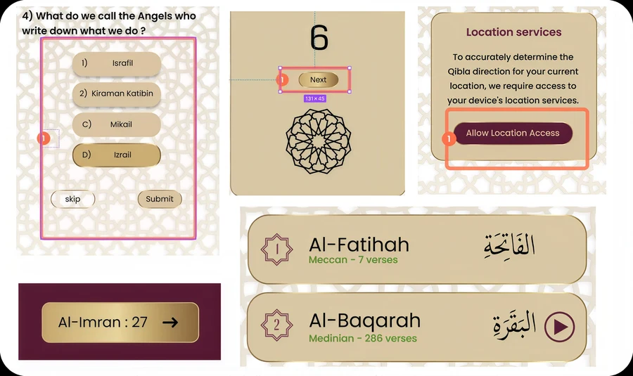
every single day?
Interviews, a survey, a focus group and usability tests with real users.
One calm daily companion.
one calm daily companion.
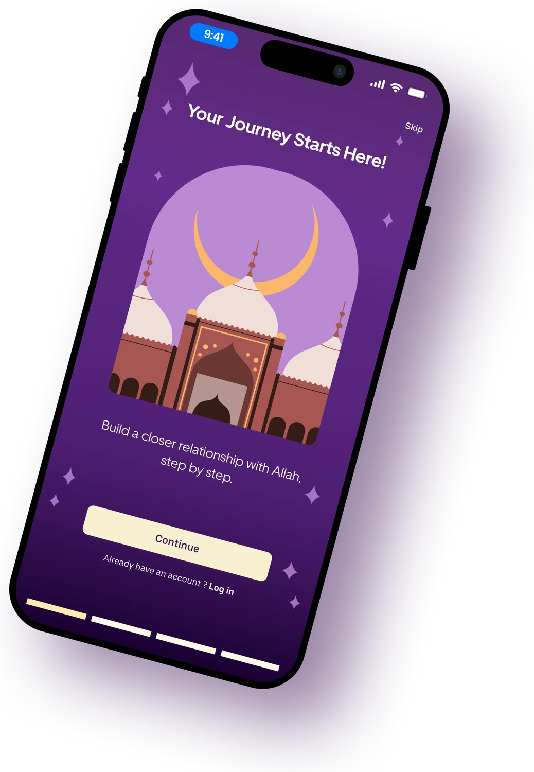
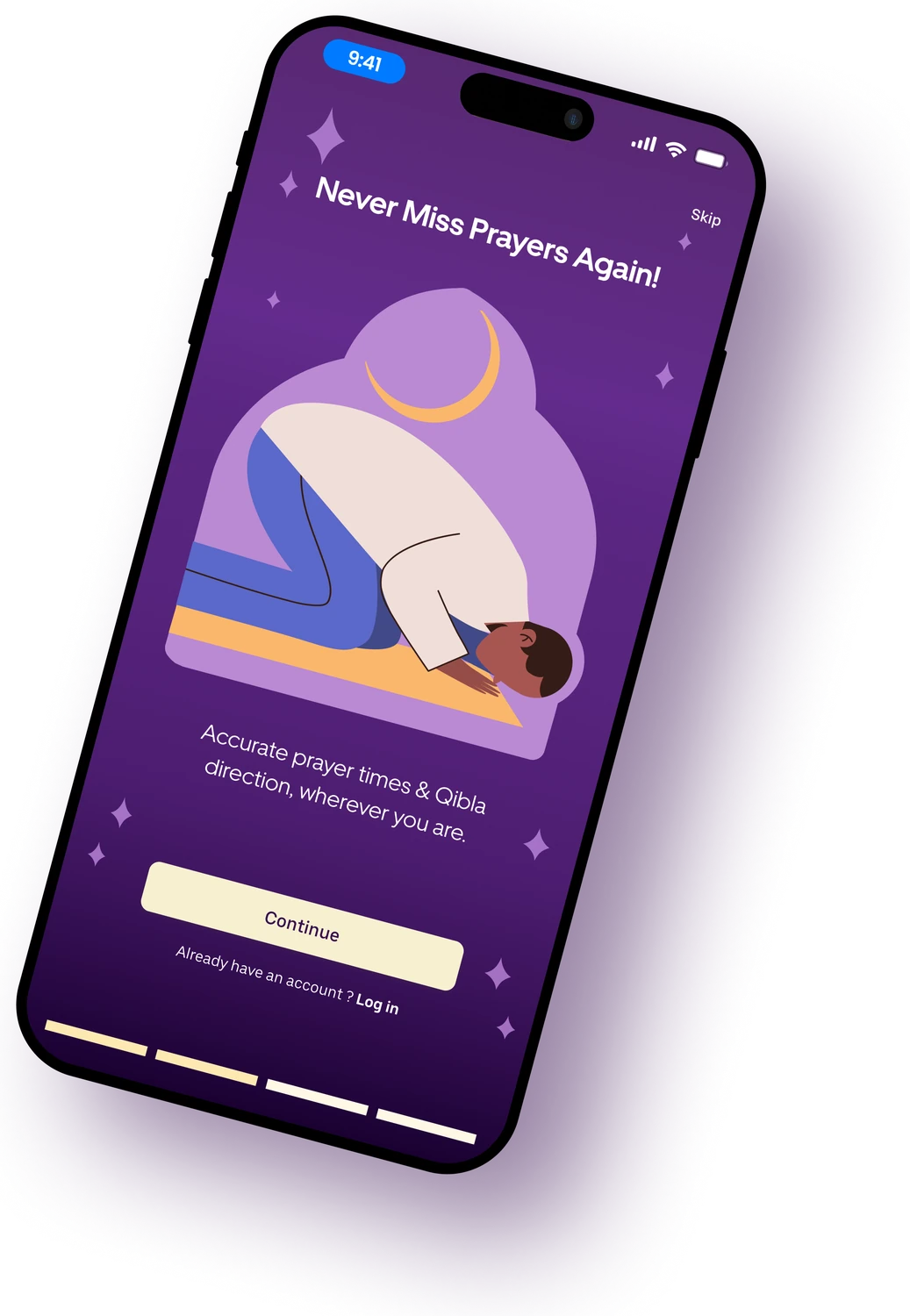
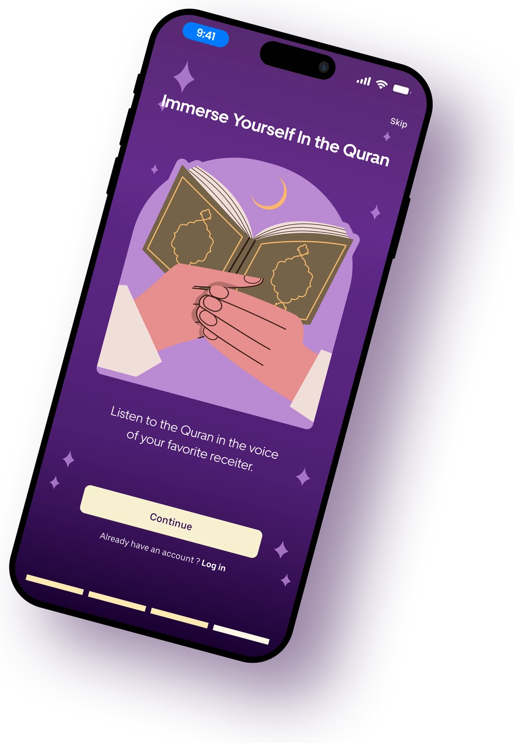
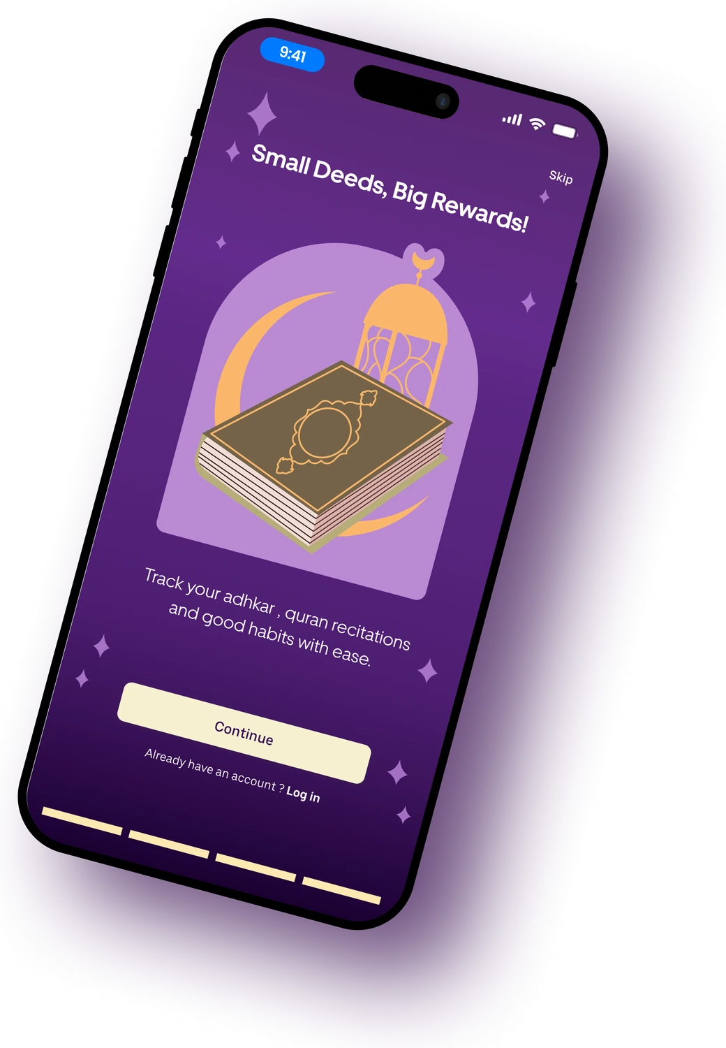
Guided onboarding
Four illustrated steps introduce prayer times, Quran, habits and the journey ahead.
Why it mattersLena felt overwhelmed. A calm, step-by-step welcome tells new Muslims where to start.
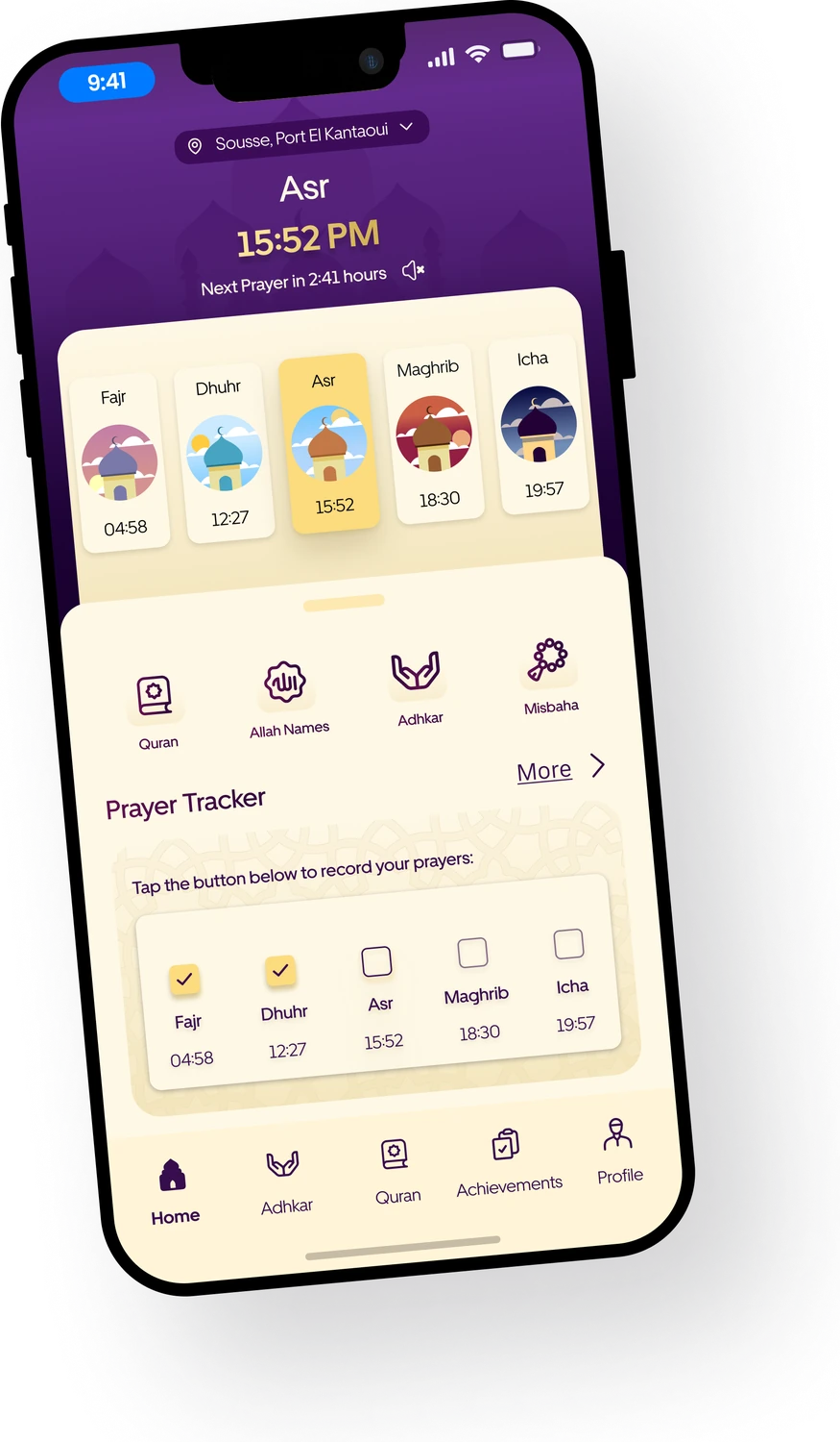
Prayer times first
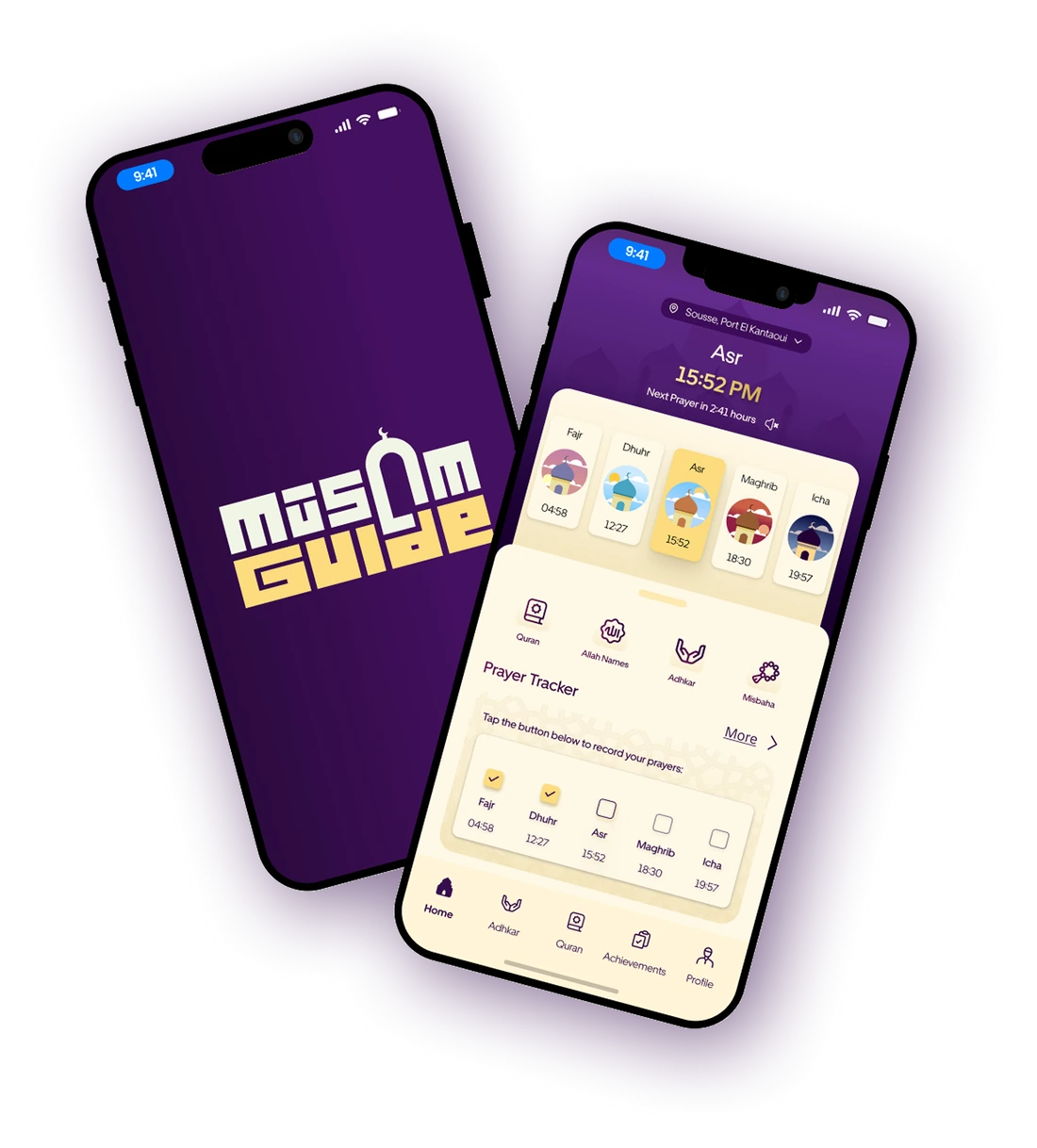
The next prayer and its countdown open the app, with a one-tap prayer tracker below.
Why it mattersMohamed Ali only wanted prayer times and Qibla fast. Now they are the first thing he sees.
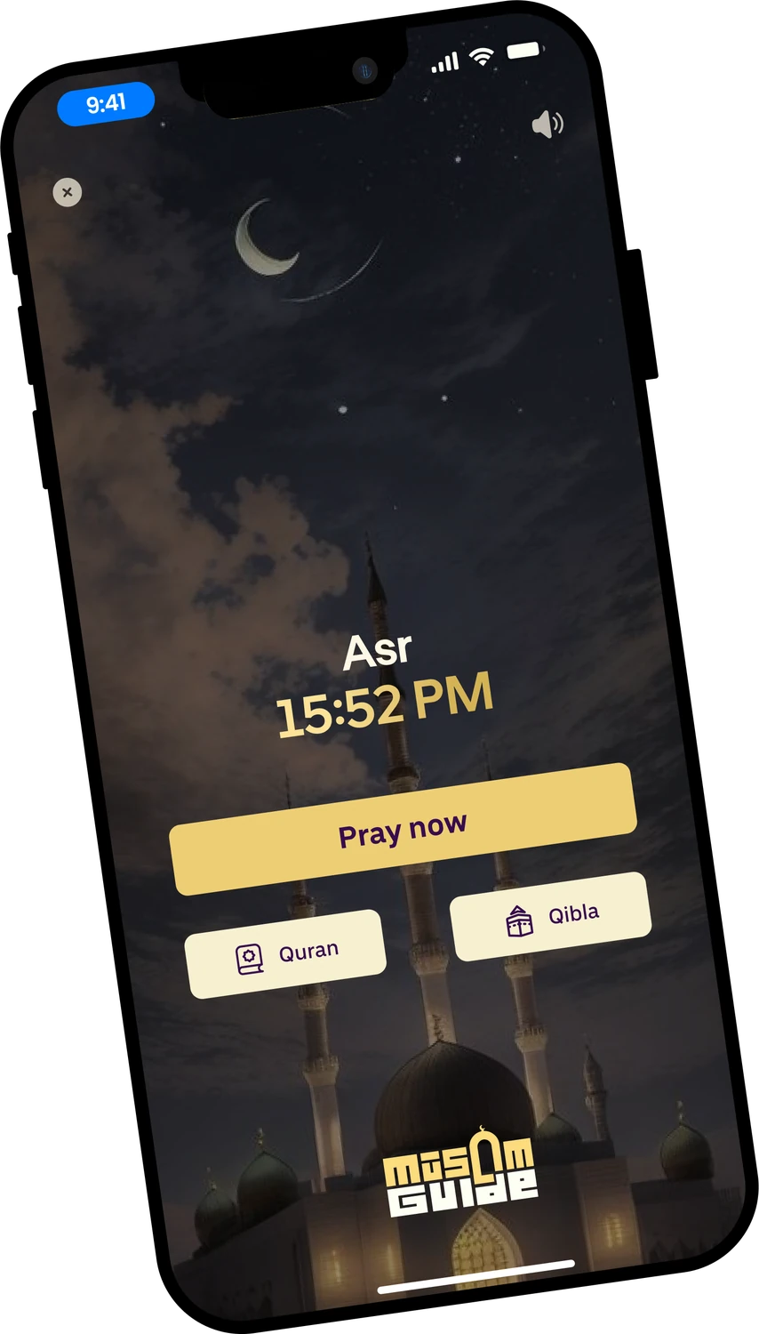
A gentle prayer reminder
When it is time, one screen: pray now, open the Quran or find the Qibla.
Why it mattersTurns a notification into an action, at the exact moment it matters.
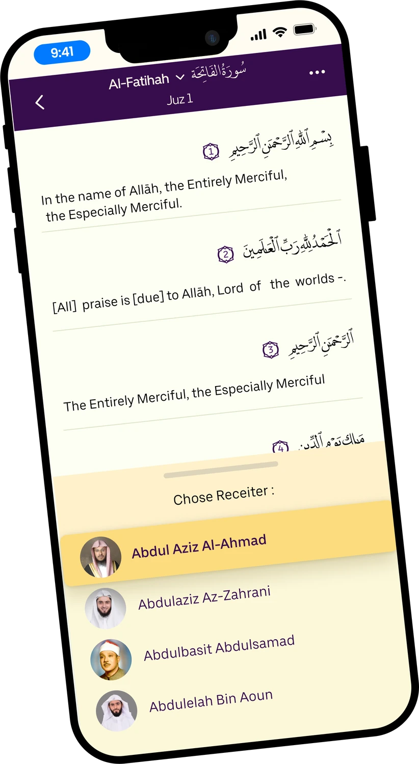
Quran with your reciter
Arabic, translation and a choice of reciters on the same page.
Why it mattersNon-native speakers can read, understand and listen without switching apps.
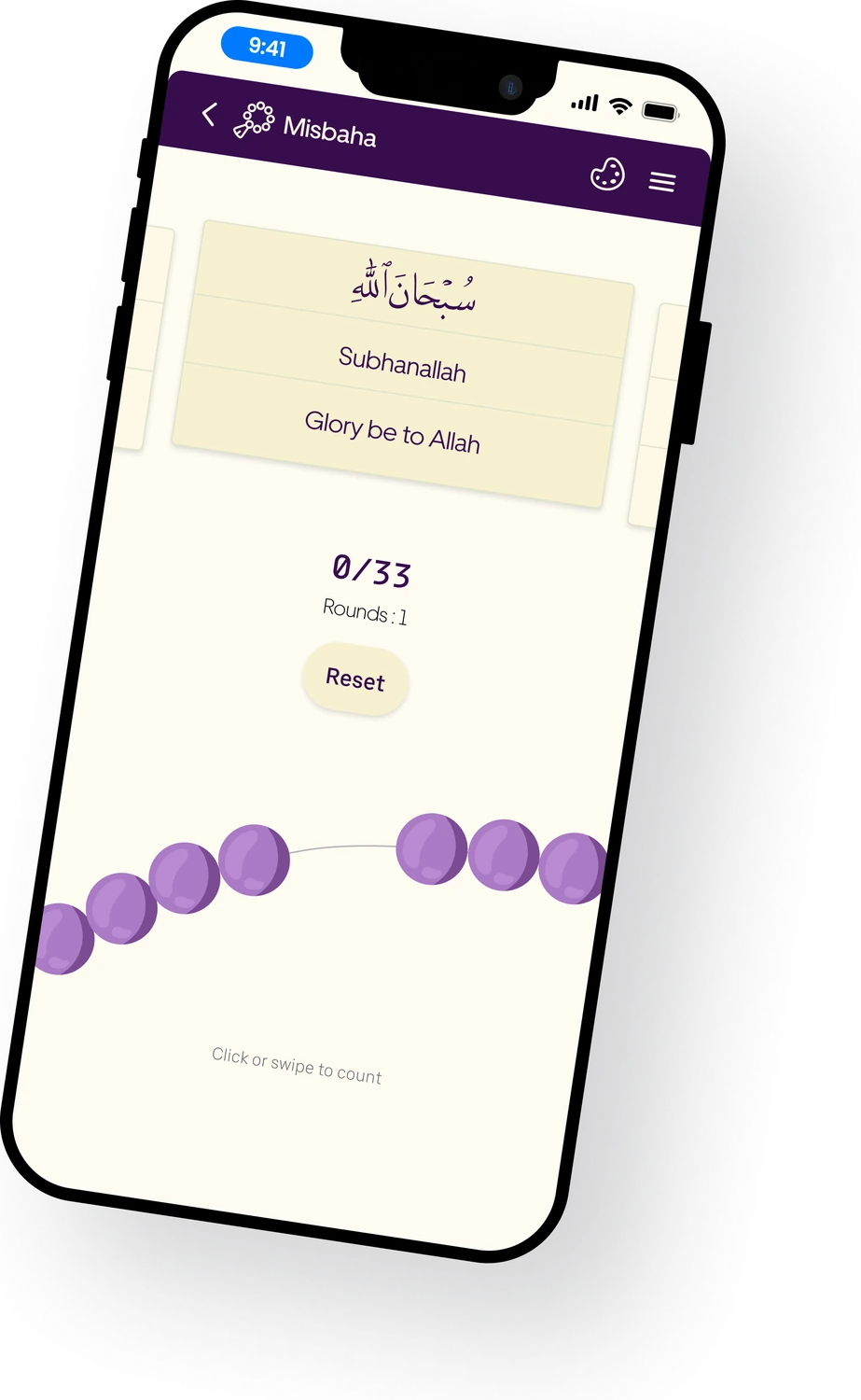
Digital Misbaha
Swipe the beads to count dhikr, with rounds and a reset.
Why it mattersA familiar ritual made tactile, so it feels like prayer beads, not a counter.
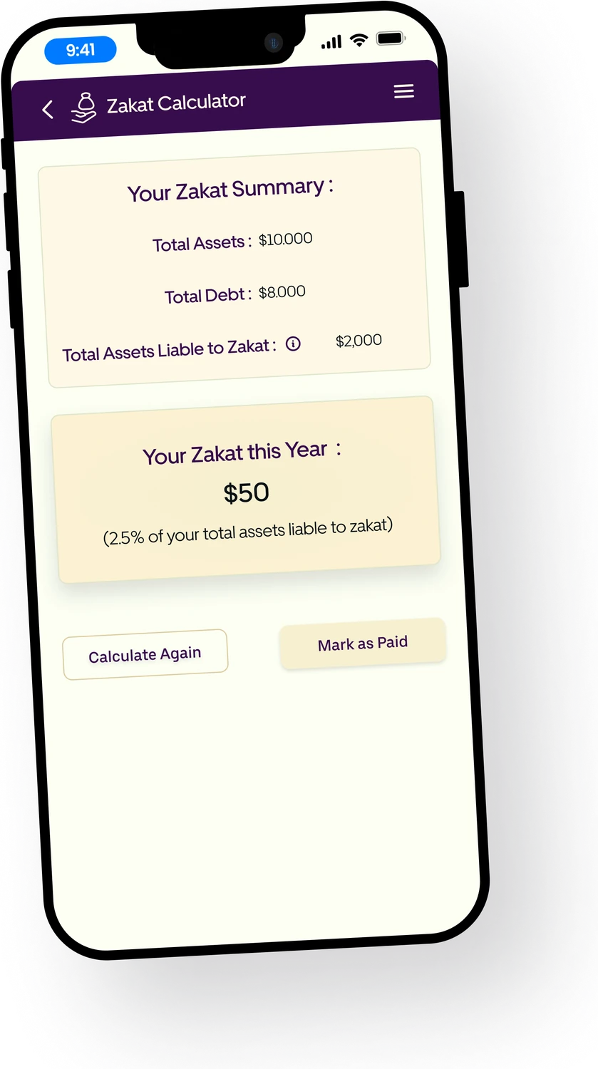
Zakat calculator
Assets, debts and the 2.5% due, summarised in one clear card.
Why it mattersA confusing yearly calculation becomes a single answer you can trust.
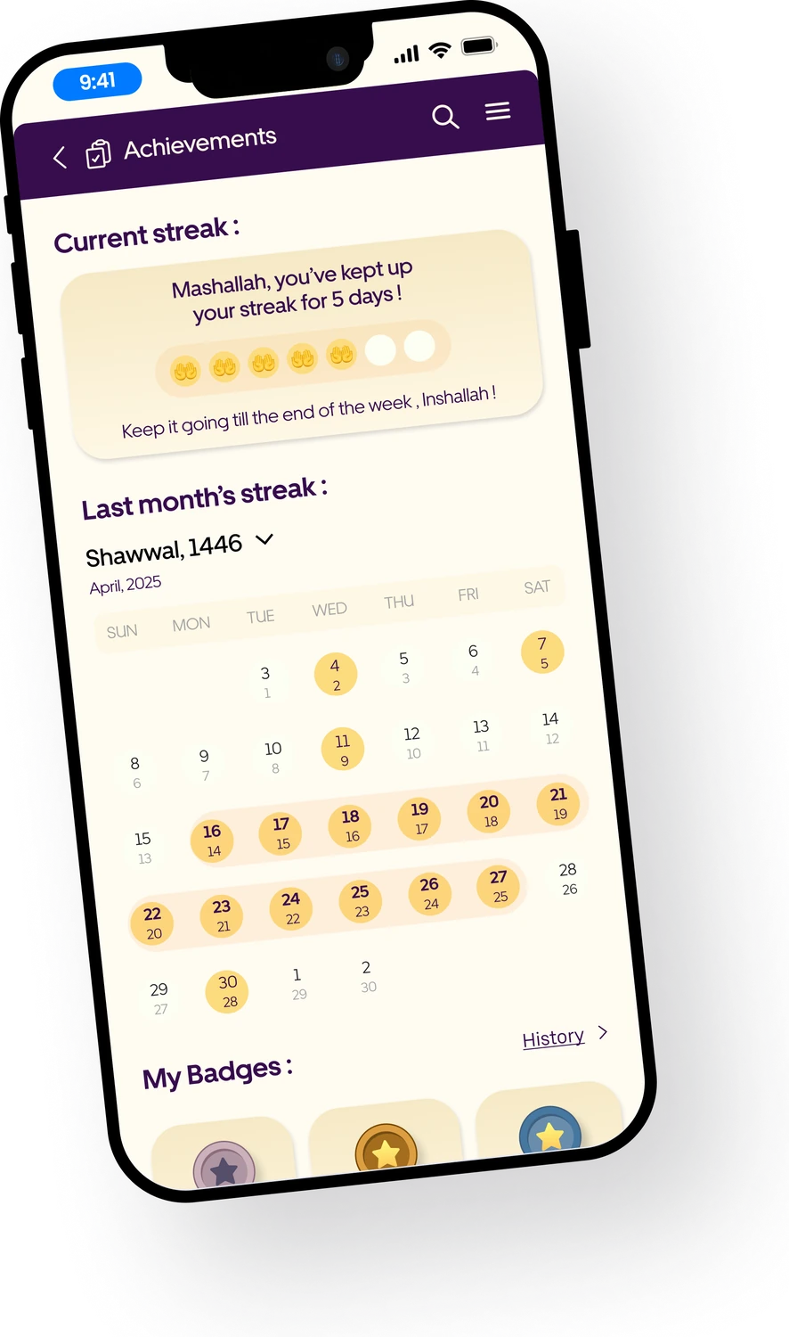
Streaks and badges
A weekly streak, a monthly view and badges to unlock.
Why it mattersThe missing habit tracker users asked for: consistency you can see.
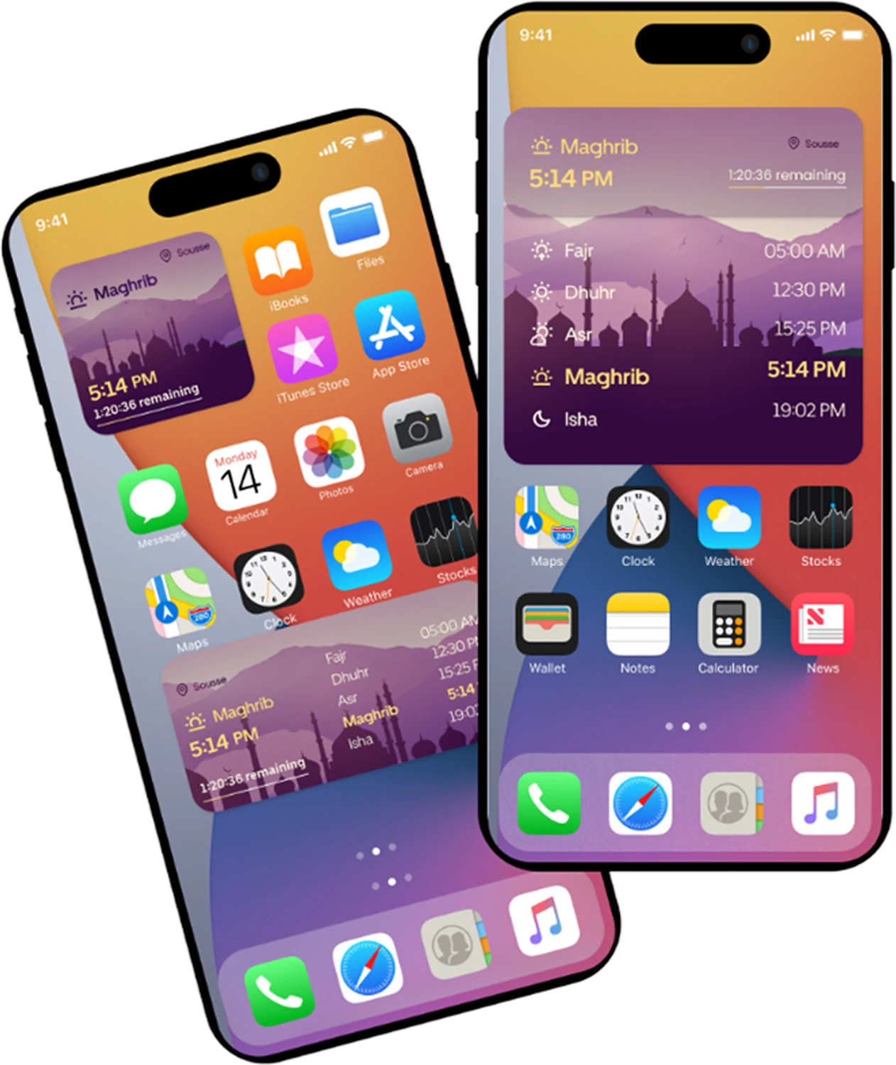
Home screen widgets
The next prayer and the full day on the home screen.
Why it mattersThe most-used information, without even opening the app.
in motion.
Now a companion that feels calm.
A high-fidelity redesign with a full style guide, guided onboarding and features grounded in what users actually asked for.
The lesson: in a product people open five times a day, restraint is a feature.