People need a reason to belong, to stay, to come back.
That's when it hit me. It's not an accident, but rather a Design Decision.
That's how I found ATFI, and exactly the problem they had.
The Problem
A decade of impact. An online presence stuck in 2012.
Since 2015: four regional branches, free training, mentorship. On paper, everything was there.
What the site was
A passive brochure, no way to join
A dated look
Nothing for young engineers
What ATFI had
A 10-year mission
Influential members and mentors
National reach, 4 cities
Central question
How do you make an existing community feel worth joining for the next generation?
Research & Discovery
What was going wrong, and for whom?
Visual audit, user journeys, benchmark, empathy maps and user stories.
01
No conversion path
No clear way to join, attend or train.
02
Outdated visual identity
It read “archive”, not “active community”.
03
Junior users invisible
Nothing spoke to students or new engineers.
04
Impact buried
Ten years of work, never shown as proof.
70+
Active members, unseen
10
Years of impact
4
Regional branches
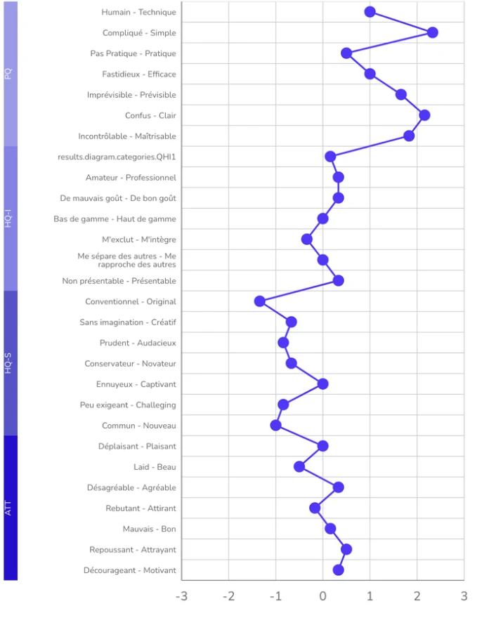
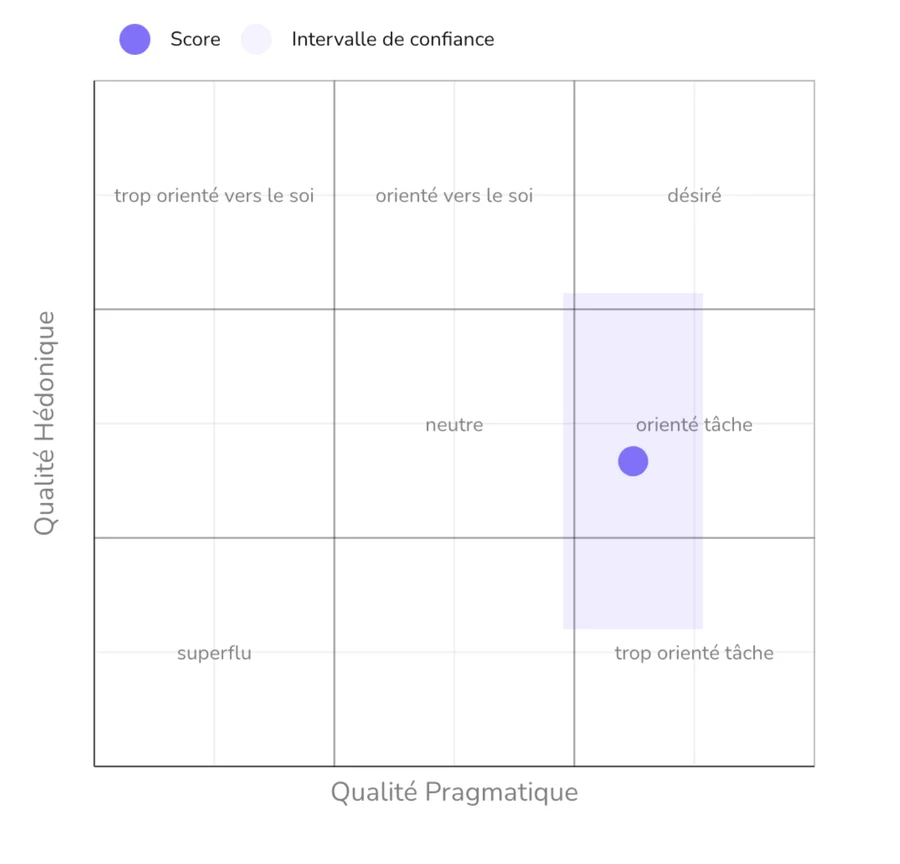
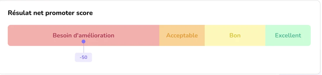
My audit of the original site: AttrakDiff and an NPS of −50.
What the founder told us
"For the new generation, ATFI is either invisible, or too intimidating to dare to get involved."
Semi-structured interview (translated)
Mme Nadia SouissiFounding President, ATFI
Users
Primary user
The Junior
Engineering student or early-career professional
Needs to feel ATFI is for her
Leaves in 30 seconds without a reason to stay
Returning member
The Veteran
Experienced engineer, already active in the community
Wants quick access to events and her profile
Doesn't need convincing, needs enabling
Shared need: an ATFI that feels active right now.
Ideation & Direction
The design process wasn't linear. It pivoted. Twice.
Testing & Iteration
The pivot wasn't a failure. It was the process working.
AttrakDiff and NPS on the first version: more appealing, still too institutional. So I rebuilt the site map around community and action, and gave ATFI Jeunes its own space.
Design & Solution
Four pillars. One direction: from showcase to platform.
Mobile-first
Designed from 375px, thumb-first.
Social proof
Numbers, photos and partners up front.
Immediate utility
Events and training on arrival.
Conversion
Join is always one tap away.
Results · Before vs after
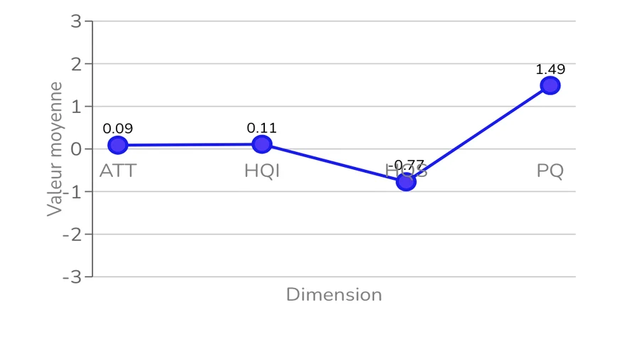
Same users. Same questionnaire. A completely different feeling.
Pragmatic quality
1.49
2.5
Hedonic quality
0.11
2.2
Stimulation
-0.77
2.1
Attractiveness
0.09
2.5
NPS
-50
+60
89.5
Global SUS score on the final prototype, well above the 68 industry average.
What we added
Four additions, each from the research.
01
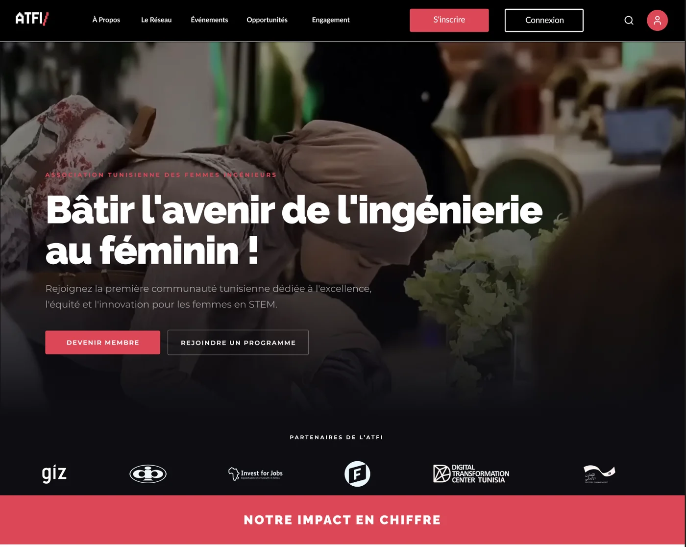
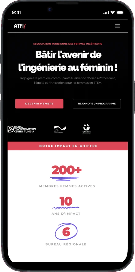
Impact, front and centre
Numbers, partners and photos right under the hero.
Why it mattersProof in the first scroll shows a newcomer this community is real.
02
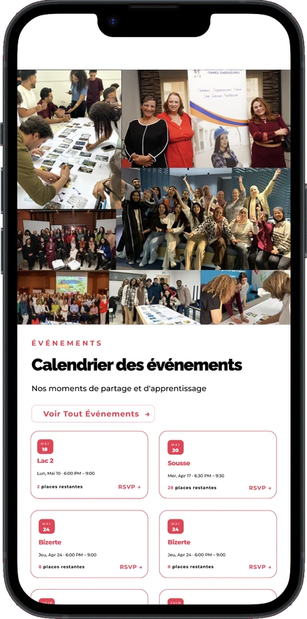
An events calendar on the homepage
Upcoming events by city, one tap to join.
Why it mattersA reason for veterans to return, an easy first step for juniors.
03
Testimonials from members
Real quotes from members, students to project leads.
Why it mattersJuniors need women to look up to. A peer’s voice beats intimidation.
04
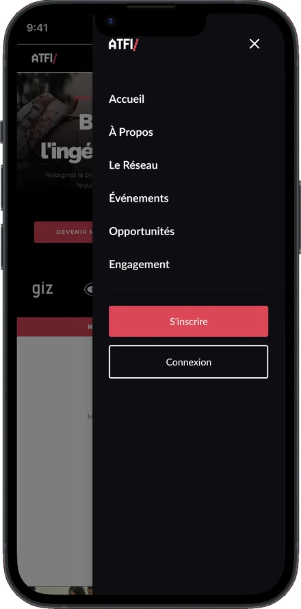
A mobile menu built for thumbs
Six clear entries, sign-up always visible.
Why it mattersJuniors live on their phones; joining is never more than a tap away.
Prototype
The prototype, in motion.
Outcome & Reflection
A community that was active. Now a platform that feels like it.
A high-fidelity, mobile-first prototype, presented to a jury.
What I'd take further
→Usability tests with real junior and senior members.
→A member dashboard for events, training and mentorship.